The Professional's View On Putney Place
'could be just what one of London's most boring suburbs needs'
Consultation is now well under way on what could be two of the most distinctive tall buildings in London, Oracle Residential's redevelopment of Putney Place.
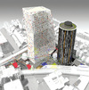
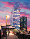
The 84 and 68 metre tall towers are designed by SMC Alsop, architects of Palestra, to stand opposite East Putney underground station in the London borough of Wandsworth. As one would expect from Alsop, the designs are bright, cheerful, and definitely stand out compared to the suburban moderation around them.
The evolution of the design has come from four concepts - Block, Flip, Split and Sculpt. Put in simple terms this begins with the basis that a U-shaped Block with a private courtyard facing the railway occupies most of the site but is merely efficient rather than a desirable and friendly design.
The architect first of all Flipped the building around so that the courtyard faced the road, giving public access to what was previously closed off and opening the inside of the site up.
The next step of Split was taking the single monolithic block and dividing it into two as the proposals have now. This also opens up the site more than if it were built on by a single structure.
The final phase is to Sculpt which sees the two buildings gradually honed to develop a more sophisticated architectural relationship between them with improved views and enhanced levels of sunlight.
 These blocks originally consisted of an ellipse and a pyramid which have then evolved thanks to the constant changes made to the design to try and rationalise their interiors and get the buildings exteriors to fit the site better.
Building 1, the taller of the buildings has a noticeable lean towards the south. It will be clad in a mixture of white, transparent and translucent glass that will come into its own at night when illuminated from the inside providing a mosaic of differing lights.
Protuding from the glass will be a series of shadow-casters, brightly coloured cut out shapes looking like they have escaped from Blue Peter. On the lower levels the shapes of these will be mimicked, enlarged and incorporated into a series of multi-coloured balconies for the likes of restaurant diners to enjoy.
Contrasting is Building 2 with black and white striped aluminium cladding and vertical rectangular window modules. Much work was done by the architect to reduce the size of the central core so the building could be as slender as possible giving it more graceful dimensions than its restricted height would otherwise allow. Crowning the tubular building is a ring of anodized aluminium rather like a halo.
Of particular note is the ground level around the shorter tower that appears to have the building standing above it on stilts, partly to keep it separate from a substation it shares the site with. These stilts are integrated in with a sculpture by Bruce McLean that fills the entire site as a series of multi-colour lines crisscrossing back and forth over the plaza.
The plaza is divided into a series of different zones which are marked including an al-fresco dining area and play areas for children. Residents will be able to enjoy a large timber decked roof terrace on Building 1 and a roof garden on Building 2. Both buildings also have many apartments with semi-enclosed spaces similar to miniature winter gardens.
 All in all, it's an incredibly brave design for a conservative borough like Wandsworth to grapple with and does much of what is needed in and around Putney's underground station to make it a more permeable area for travellers.
Strong shapes and bright colours resembling those taken from a child's playset are less likely to be everyone's cup of tea but Putney Place could be just what one of London's most boring suburbs needs to give it a kick up the backside.
September 18, 2008
article reproduced with permission from skyscrapernews.com
Related links
|
